

COVID-19 patients are filling hospitals
COVID-19 patients are filling hospitals
Over 80,000 Americans are currently hospitalized with COVID-19. What does that mean for healthcare systems in your state?
Welcome back to the COVID-19 Data Dispatch.
This week, I’m exploring new data offered by the Department of Health and Human Services (HHS) that expand public knowledge of how the COVID-19 pandemic is hitting hospitals across the country. Plus: this week’s record numbers, other federal data updates, a new reader survey, and the first Centers for Disease Control and Prevention (CDC) media briefing in months.
It’s been a strange, stressful week for me: my girlfriend and I are holed up in a friend’s apartment, completely isolated from the outside world, so that we can safely visit our respective parents. We got tested this morning at one of the NYC Health + Hospitals sites; though neither quarantine nor a negative result is a perfect indicator that one is COVID-free, we’re doing the best we can to keep our families safe.
If you have questions about pandemic safety, data, or anything else COVID-19-related, my comment sections, email inbox (betsyladyzhets@gmail.com), and Twitter DMs are always open.
National numbers
In the past week (November 15 through 21), the U.S. reported about 1.2 million new cases, according to the COVID Tracking Project. This amounts to:
An average of 167,000 new cases each day (19% increase from the previous week)
358 total new cases for every 100,000 Americans
1 in 279 Americans getting diagnosed with COVID-19 in the past week
10% of the total cases the U.S. reported in the full course of the pandemic
, cases (178,309), hospitalizations (83,227), and deaths (1,506).")
1 in every 114 Americans has been diagnosed with COVID-19 since the beginning of November, and cases aren’t slowing anywhere in the nation. The COVID Exit Strategy tracker categorizes the spread in every state except for Maine and Hawaii as “uncontrolled”; even Vermont, praised by public health experts for its mitigation efforts, is now seeing record numbers.
America also saw:
10,100 new COVID-19 deaths last week (3.1 per 100,000 people)
83,200 people currently hospitalized with the disease, as of yesterday (20% increase from the previous week; 76% increase from the start of November)
To see how your community is faring, check the COVID-19 Risk Levels Dashboard for state- and county-level insights.
Were you forwarded this newsletter? Subscribe here:
HHS releases data on new admissions, staffing shortages
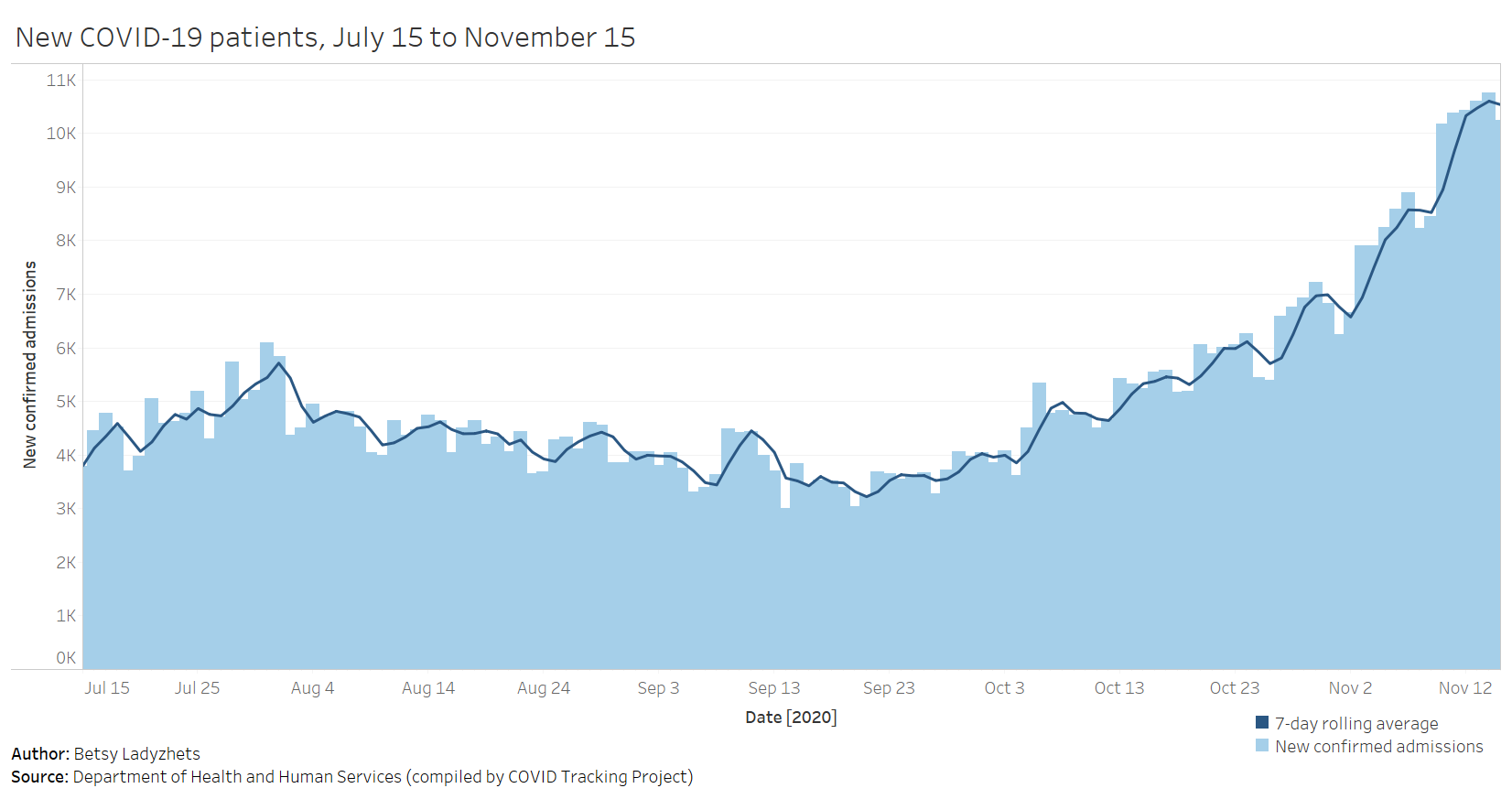
How many people in the U.S. are currently hospitalized with COVID-19? As of yesterday, 83,200.
This question calls attention to the people deeply impacted by the pandemic—people in hospital beds, on ventilators, struggling to breathe. But it is also a deeply practical question. Public health experts and policymakers need to know where hospitals are becoming overwhelmed with patients in order to distribute supplies where they are most needed. Researchers and data nerds like myself, meanwhile, can use hospitalization metrics to track the pandemic’s impact on different communities: reported cases may be an unreliable metric, challenged by inadequate testing and uneven reporting guidelines, but it’s hard to miss a person in the hospital.
Longtime readers may remember that this newsletter started because of hospitalization data. Back in July, when hospitalization data moved from the purview of the CDC to the HHS, I wanted to explain why these data are so important and how the change in control impacted the numbers themselves. In the months since, the HHS has increased both the number of hospitals reporting to its system and the volume of information that is publicly released about those hospitals.
I’m returning to the topic now because the HHS has made two major upgrades to its hospitalization dataset in the past week: it now includes new admissions and staffing shortages for every state. The metrics are only available at the state level; I’m hoping that county- and even individual hospital-level numbers may be released in the coming weeks.
New admissions are a useful metric because they provide a clear picture of where outbreaks are worsening, and by what degree. Patients may stay in the hospital (and be counted in a “current hospitalizations” figure) for weeks on end; isolating the number of new patients incoming allows public health researchers to see how the burden on hospitals is growing.
Across the U.S., over 10,000 patients with confirmed cases of COVID-19 are now being admitted each day.
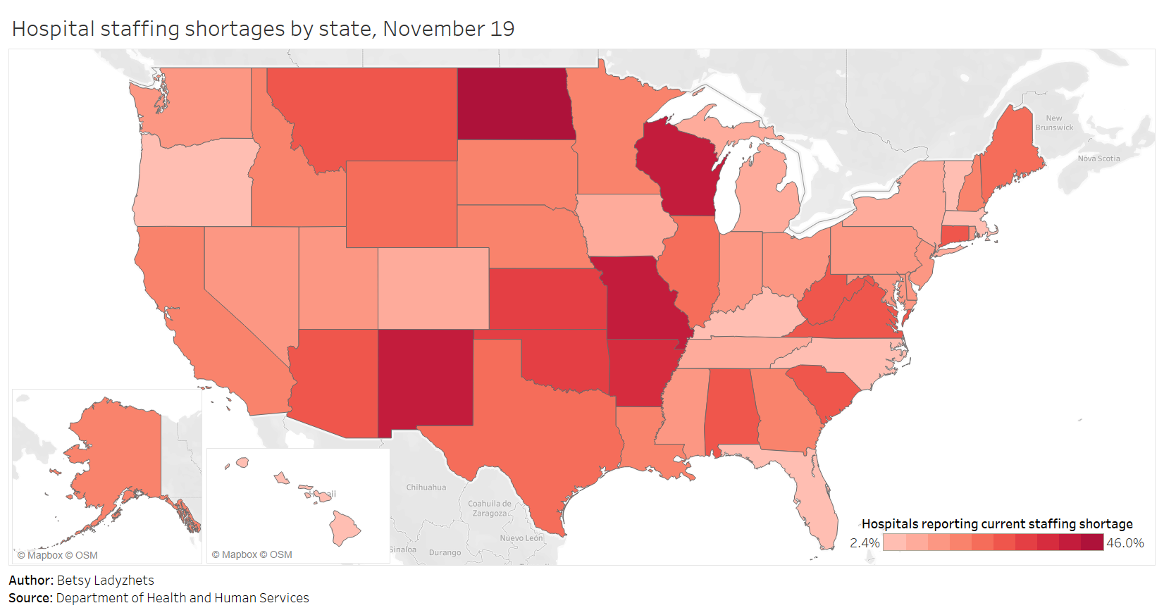
Staffing shortages, meanwhile, are a useful metric because they demonstrate where in the country healthcare systems are hardest hit. The HHS specifically asks hospitals to report when their staffing shortages are critical, meaning that these facilities are in serious danger of being unable to operate as normal. Staffing shortages may be the result of healthcare workers feeling burnt out, quitting, or becoming sick with COVID-19 themselves.
As of November 19, the most recent date these data are available, 18% of hospitals are currently facing a critical shortage—that’s about 1,100 out of the 6,100 hospitals reporting. 200 more hospitals report that they will be facing a critical shortage in the next week.
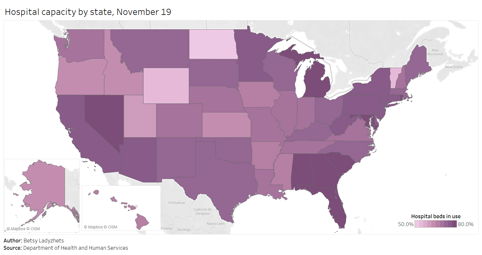
Finally, here’s a look at the nation’s current hospital capacity—that is, how many hospital beds are currently occupied with sick people. As of November 19, about 600,000 of the nation’s 980,000 hospital beds are full (61%). 88,000 of those people have been diagnosed with COVID-19 (9%). These numbers will grow in the coming weeks as thousands of recently diagnosed Americans become sicker.
For more context on these hospitalization data and what they mean for the exhausted, terrified healthcare workers serving patients, check out:
‘People are going to die’: Hospitals in half the states are facing a massive staffing shortage as Covid-19 surges (STAT News)
One Million Cases in Seven Days: This Week in COVID-19 Data, Nov 19 (COVID Tracking Project)
This newsletter is a labor of love for me each week. If you appreciate the news and resources, I’d appreciate a tip:
More federal data updates
America’s federal public health agencies are busy in the lead-up to Thanksgiving, as are the researchers and volunteer networks filling those agencies’ information gaps. Here are three major updates:
CDC’s COVID Data Tracker now reports more county-level data: Since it was first published in the spring, the CDC’s COVID-19 data dashboard has included cases and deaths by U.S. county, relying upon data compiled by USA Facts and verified by the agency. As of yesterday, the county dashboard now also reports total PCR tests and test positivity. Testing data have previously been available directly from the HHS (state-level) and the Center for Medicare & Medicaid Services (county-level), but the CDC dashboard is far more accessible. Users can select a specific county and see a variety of trends in cases, tests, and deaths. The data from this dashboard aren’t yet available for download; I’ll report back if this changes.
Pharmacies will be able to distribute COVID-19 vaccines: Last week, the HHS announced that the agency has set up partnerships with both national pharmacy chains and networks representing smaller pharmacies in order to broadly distribute COVID-19 vaccines as they become available. (Pfizer applied for Emergency Use Authorization this past Friday.) According to the HHS, these partnerships cover “approximately 60 percent of pharmacies throughout the 50 states, the District of Columbia, Puerto Rico, and the U.S. Virgin Islands.” The press release does not mention how these pharmacies will be plugged into their respective state vaccine registries.
How state COVID-19 dashboards are faring: Although many states are reporting more COVID-19 data than they were last spring, their dashboards are overall still not conveying some key metrics, according to a new report from Resolve to Save Lives. This research group, a nongovernmental initiative run by the global health organization Vital Strategies, first reviewed state dashboards in July. (See my first issue for more details.) The new report—along with an interactive map—reflects improvements that states have made since the summer while highlighting what crucial public health information is still missing. Case investigation and contact tracing are two key areas where “data… remained largely unavailable.”
Racism is a public health threat
This week, the American Medical Association (AMA) announced that the association recognizes racism as a public health threat. The association is adopting a new policy which acknowledges systemic racism, cultural racism, and interpersonal racism as barriers to healthcare for many Americans and as threats to equitable public health across the country. Although the policy does not specifically address COVID-19, it speaks to the impact that America’s racist history and healthcare system has had in making it more likely for Black Americans to become infected with the coronavirus and suffer worse health outcomes.
“The AMA recognizes that racism negatively impacts and exacerbates health inequities among historically marginalized communities. Without systemic and structural-level change, health inequities will continue to exist, and the overall health of the nation will suffer,” said AMA Board Member Willarda V. Edwards, M.D., M.B.A.
I highlighted this decision because, in order to address a public health threat, the threat must be tracked with good, complete data. In the several months I’ve worked on the COVID Racial Data Tracker, I have seen how public health agencies often push demographic data on COVID-19 into inaccessible charts or hard-to-find reports, or do not even report these data at all. In other words, it may be difficult for many people of color in the U.S. to find crucial information on how the pandemic is impacting their communities.
Many states have greatly increased their demographic reporting on COVID-19 cases, deaths, and other metrics since the spring, and states have supported initiatives to serve minority communities. But there is still a lot of room for improvement. The AMA’s decision signals that the medical community is committed to dismantling the threat racism poses to American public health. Journalists, science communicators, and other community leaders must join in that work.
If you’d like to advocate for better demographic data in your state: you can see the disparities using the COVID Racial Data Tracker’s Infection and Mortality charts, and you can reach out to your state’s leadership with a custom contact form.
Quick reader survey (Round 2!)
This is the second in my series of quick surveys, which I’m using to better get to know all of you wonderful readers. Thank you to everyone who filled out the first one! I’m running four of these total; they’ll be sent out in alternating weeks.
Like the first survey, this is only one question. I’ll share a few responses from readers who indicate they’re comfortable with it in the next issue.
Featured sources
These sources, along with all others featured in previous weeks, are included in the COVID-19 Data Dispatch resource list.
State COVID-19 vaccine plans: A new report from the Kaiser Family Foundation explores how state public health departments are planning to distribute COVID-19 vaccines once they become available. The report includes common themes and concerns across all 50 state plans, as well as links to the plans themselves. One insight that stuck out to me: “Just over half (25 of 47, or 53% ) of state plans report having immunization registries/database systems in place that are described as being (at least fairly) comprehensive and reliable; in the other state plans that information is unclear.”
COVID-19 Testing Communications Toolkit: The Brown School of Public Health has compiled a resource to help public health communicators encourage COVID-19 testing. The toolkit includes evidence-based tutorials, handouts, and an image library, all of which are free for public use.
COVID-19 and Impacted Communities: A Media Communications Guide: This is another communications tool from the New York COVID-19 Working Group. The guide includes best practices for explaining key terms, advice on framing stories, and how to avoid stereotypical narratives about minority communities.
SARS-CoV-2 and COVID-19 Data Hub: Erin Sanders, a nurse practitioner and contact tracer, has compiled a list of data sources on the novel coronavirus. The list includes clinical data, transmission data, and genomic data, among other medical and epidemiological topics.
COVID source shout-out
This past Thursday, the CDC held a media briefing. Normally, this wouldn’t be big news; the agency is expected to alert the press—and by extension, the American public—of major new developments in its work. During the pandemic, however, the very existence of these briefings has become newsworthy.
The CDC held COVID-19 briefings regularly throughout January, February, and March, then stopped abruptly at the height of the spring outbreak in the Northeast. The next briefing after that was in June, and they’ve been sporadic since. Before Thursday’s call, the previous two briefings were held in late October and mid-August.
Thursday’s press call highlighted the release of a new CDC guidance, which encourages Americans not to travel for Thanksgiving and provides safety suggestions for those who feel they must travel. Reporters on the call (fairly) questioned why the CDC put out this new guidance now, only a week before the holiday, when many Americans have already made plans. Public health experts, science communicators, and others (including this newsletter) have been calling for reduced Thanksgiving travel for several weeks now.
Still, the guidance and associated press call indicate that the CDC wants to step up as the nation’s outbreak worsens. Whether the agency can regain public trust remains to be seen.
More recommended reading
Stacker Science & Health coverage
News from the COVID Tracking Project
Cases Race Past Previous Highs: This Week in Long-Term Care COVID-19 Data, Nov 17
One Million Cases in Seven Days: This Week in COVID-19 Data, Nov 19
Bonus
A Lack of Transparency Is Undermining Pandemic Policy (WIRED)
503: Inside the COVID unit at the world’s largest women’s prison (The 19th)
How Biden plans to fix the coronavirus testing problem (POLITICO)
How well a mask works depends on how well it fits (Popular Science)
That’s all for today! I’ll be back next week with more data news.
If you’d like to share this newsletter further, you can do so here: