Your Thanksgiving could be a superspreading event
Understanding superspreading events can help us mitigate our COVID-19 risk as we head into the winter. Plus: this week's record case numbers and other updates.
Welcome back to the COVID-19 Data Dispatch, where I’m not covering the election. Well… not directly.
This week, my big story is superspreading events: what they are, how we identify them, and how understanding them can help us control our COVID-19 risk as we approach the holiday season.
I am also trying out some formatting adjustments this week which may carry over for future issues. My big story is more concise, and rather than leading with that informational essay, I’m starting the issue with a broad update on where America’s COVID-19 numbers currently stand. I’m also kicking off a short survey series which I’m conducting to learn how I can better serve you, my wonderful readers.
Plus, updates on how the federal government is handling antigen testing and a recent Stacker project of mine which puts COVID-19 numbers in context.
National numbers
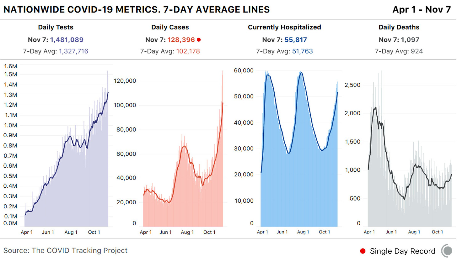
In the past week (November 1 through 7), the U.S. reported about 715,000 new COVID-19 cases, according to the COVID Tracking Project. This amounts to:
An average of 102,000 new cases each day
218 total new cases per 100,000 people
1 in 460 Americans getting diagnosed with COVID-19
2.7 times the total cases Canada has reported over the entire course of the pandemic
While the Midwest is bearing the brunt of this recent surge, cases are rising across the country. 23 states broke their COVID-19 records in the past week, and the COVID Exit Strategy tracker currently categorizes almost every state as “trending poorly” or “uncontrolled spread.” Vermont and Hawaii are the only two exceptions.
America also saw:
6,900 new COVID-19 deaths last week (2.1 per 100,000 people)
55,800 people currently hospitalized with the disease (as of November 7)
There is no doubt that we’re seeing a third national surge, and we should not expect it to let up anytime soon. I recommend checking the COVID-19 Risk Levels Dashboard (by the Harvard Global Health Institute, Brown School of Public Health, et al.) for more detail on the current risk in your community.

COVID-19 doesn’t spread—it superspreads
Between 10% and 20% of people infected with COVID-19 are responsible for 80% of the virus’ spread.
You might have seen this statistic before, but take a second to think about what it means. Imagine that one unlucky person at a crowded restaurant, infected with the novel coronavirus but not yet symptomatic enough that she has noticed, spreads the virus to ten others. Meanwhile, her ten coworkers, who all contracted the virus at the same time as she did, do not spread the virus to anyone else at all. This type of dispersal—what epidemiologists call a large k value—introduces a level of randomness to COVID-19 spread which makes it difficult to track and protect against.
But scientists are learning to better understand COVID-19 spread by keeping tabs on those instances where one person infects many, which they call superspreading events. While research continues about the underlying biology driving who is infectious and who isn’t, investigating the events in which people get infected can help us better understand how to protect ourselves and our communities.
For more thorough explanations into the science of superspreading, I’d recommend you read Christie Aschwanden in Scientific American, Zeynep Tufekci in The Atlantic, or Martin Enserink, Kai Kupferschmidt, and Nirja Desai with an incredible series of scrolly visualizations in Science Mag.
Here, I’m focusing on the data around these events: how we identify them, what the data tell us so far, and why we should keep them in mind as temperatures drop and cases rise.
How do we find superspreading events?
The CDC defines a superspreading event as one in which “a few persons infect a larger number of secondary persons with whom they have contact.” This leaves a lot of room for interpretation, as different researchers have different thresholds for determining how many people must be involved. Depending on who you talk to, anything from a 500-person rally to your extended family’s Fourth of July gathering might fit the definition.
So, when you see a sensationalist article claiming that some event caused superspreading, it is important to consider what definition was being used and how the given event was identified as one that fits.
There are three ways superspreading events can be identified:
Continuous tracking of an outbreak site: This is the easiest way to find superspreading. You have a place with a lot of people—say, a nursing home, a prison, a college campus—and you watch how many cases erupt over time. This may be an easier means of finding events because local administrations or public authorities are conducting regular testing and making data public; meanwhile, the sites themselves may have large groups of people living and working in close quarters, which is a prime environment for virus spread. Scientists count these sites as superspreading events even though they are not “events” in the way we usually think of the word because this type of long-term superspreading can have the biggest impact. California’s San Quentin State Prison, for example, was ordered to reduce its prison population after over 2,000 prisoners tested positive.
Contact tracing: This strategy, in which public health officials contact individuals who test positive and ask them about their contacts to find other infected individuals, has not taken off in the U.S. as it has in other countries, which makes it harder for us to identify superspreading events. It works like this: if contact tracers find that one new case is a teacher at an elementary school, for example, they can call other teachers and school administrators to find out which other cases are connected to that location. Japan has famously avoided widespread lockdowns by employing a “cluster-busting” strategy in which officials contact-trace backwards from new cases in order to find how those people got infected, then tell other people at the spreading events to isolate. Scientists in Europe and the U.S. are now promoting this approach as our cases surge.
Scientific studies: This strategy of superspreading identification is perhaps the least consistent, but it gets the most press. Epidemiologists may use publicly available case data, cell phone tracking data, or other information to look for patterns in new cases after major events. Such studies may draw attention, as a working paper on the Sturgis, South Dakota motorcycle rally did in September, but it can be difficult for scientists to investigate events when they don’t have access to data on precisely which cases are connected and how. The Sturgis paper was criticized for making estimates based on unreliable data. A similar new paper on the COVID-19 impact of Trump rallies is currently undergoing peer review.
Where do superspreading events happen?

Independent researcher Koen Swinkels started a database to answer this question. The database is compiled from media reports, scientific papers, and public health dashboards, as well as volunteer reports. (You can submit an event through a form on the database’s site.)
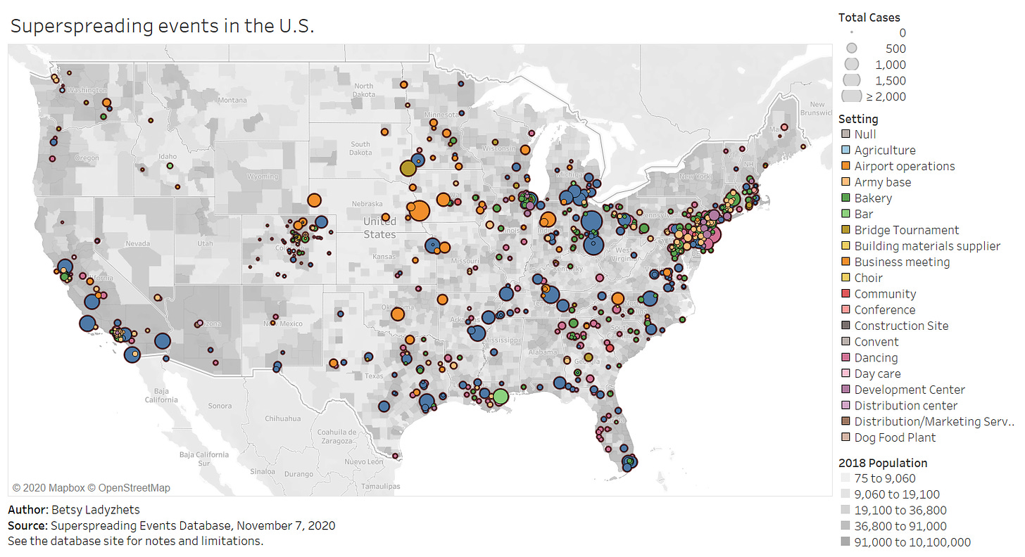
As of November 7, the database includes about 1,600 superspreading events, ranging from churches to dinner parties to meat processing plants. About 1,100 of these events took place in the U.S. For those American events, the most common superspreading settings by far are prisons (50,000 cases), rehabilitation/medical centers (27,000 cases), nursing homes (26,700 cases), meat processing plants (13,900 cases), and other medical centers (12,200 cases). Parts of the Northeast, West Coast, and South are heavily represented in the database, while other areas of the country have yet to see significant superspreading events logged.
You can explore the map pictured above, as well as a bar chart which organizes superspreading settings by their COVID-19 case numbers, in a pair of interactive Tableau visualizations which I built based on this database.
Swinkels emphasized in an email to me that the database is not at all representative of all COVID-19 superspreading events which have taken place, in America or around the world. “Hundreds of millions of people have been infected with SARS-CoV-2, while we have only about 200,000 cases linked to the 1,600 superspreading events in our database,” he said.
He and other members of the team, including professors at the London School of Hygiene and Tropical Medicine, are currently compiling events from the most easily available public sources, which he admits is not a comprehensive strategy. Swinkels also noted that the events identified by public sources may be biased by where public health officials direct their focus, which can lead to settings that were closed in the spring or are now operating under restrictions being left out of this database and of superspreading research more broadly. The database is also biased by the team’s English-language familiarity; they are looking to find more events described in non-English language publications.
What does this mean for the holidays?
This newsletter topic was inspired by a reader question I got last week: Ross asked me how post-election gatherings and holiday celebrations might contribute to COVID-19 spikes.
The evidence so far suggests that protests have not yet been a major cause of COVID-19 spikes. But “so far” is doing a lot of work in that sentence. While protests are generally outside and see high mask compliance, Swinkels explained, they tend to involve talking and singing in close contact, and instances of transportation and socialization around a protest might pose more risk. (Imagine, for example, shouting “FUCK TRUMP!” in a crowd of 500 with two friends, going to an outdoor bar together afterward, then each taking the bus home to three different parts of the city. That’s a lot of risk for one evening.)
More research on protests is necessary to truly determine how much risk they might pose to the communities around them. And, as contact tracing apparatuses in different parts of the country scale up—slowly but surely—such research will get easier.
Holiday celebrations, on the other hand, are a definitive cause for concern. These celebrations almost always occur indoors, involve talking and eating, and bring people together from disparate locations. Superspreader events also almost always occur indoors, may involve loud talking, and expand COVID-19 risk from one area to another. There’s a reason that Dr. Anthony Fauci’s daughters are not traveling home for Thanksgiving.
I asked Koen what he’d learned from compiling and comparing hundreds of superspreader events. “Knowing more about where and when superspreading events occur can help you to avoid high-risk situations and live more freely in low-risk situations,” he said. He listed several key risk factors: indoors, poor ventilation, many people, close together, prolonged periods, loud vocalization (such as singing or shouting), and cold, dry air.
He also highlighted the importance of understanding aerosol transmission. The six feet rule we’ve all come to know and flaunt is based on the dispersal of larger air particles, which don’t travel far from an infected person. But aerosols, which are smaller particles, are able to travel further and stay in the air longer—especially in indoor, poorly ventilated spaces. You can sit all the way across the room from Grandma while you eat, but if masks are off and all the windows are closed, it won’t make much difference. This FAQ document by aerosol scientists provides much more detail about how this type of COVID-19 spread works.
I’m not going to tell you to avoid traveling for the holidays; I’m not a public health expert, I don’t have that authority. But I can give you this fact: your Thanksgiving could be a superspreading event. So could the train you take to get to your relatives’ house. So could the bar where you go for outdoor drinks a few days before traveling. In order to make it through this winter, we must all be aware of our risks and adjust our behavior accordingly.
Questions? Comments? Leave a public note on the post, or hit me up at betsyladyzhets@gmail.com.
Federal data source updates
As cases spike, the Department of Health and Human Services (HHS) is focusing on rapid testing as a means to control the pandemic. But data on this type of testing continue to be widely unavailable.
HHS funds new COVID-19 tests: On October 31, HHS and the Department of Defense announced a $12.7 million contract with InBios International, a Seattle-based diagnostic testing company. The contract aims to help InBios increase its production capacity for two COVID-19 tests: a rapid antigen test called the SCoV-2 Ag Detect Kit and an antibody test called the SCoV-2 Detect IgM/IgG Food & Drug Administration (FDA).
HHS distributes antigen tests to HBCUs: At the end of September, the Trump administration announced that Historically Black Colleges and Universities (HBCUs) would be one category of priority sites for the distribution of Abbott BinaxNOW antigen tests, of which the administration has purchased 150 million. This promise is now coming to fruition; HHS announced on October 31 that 389,000 BinaxNow tests have been distributed to 83 HBCUs in 24 states, at no cost to the schools. How these schools will use the tests and report their testing data, however, remains to be seen.
FDA reminds antigen test providers to use them properly: The FDA issued a letter to clinical laboratory staff and health care providers on November 3, reminding them that antigen tests may incur false positives when the instructions for these tests’ use are not correctly followed. FDA recommendations include using antigen tests for symptomatic individuals, handling tests correctly, and using PCR tests to confirm results in low incidence counties. As I’ve discussed in this newsletter before, incorrect use of antigen tests may lead to misleading results that waste clinical resources or instill false confidence in people who receive false negatives.
HHS needs better testing oversight and data: Two new articles in STAT News this past week have discussed COVID-19 test regulation and reporting. An investigation by Kathleen McLaughlin finds that laboratory developed tests, diagnostic tools developed by and for specific facilities, fall in a “regulatory gray area” which makes it easy for innacuracies to slip past the FDA and HHS. Meanwhile, an op-ed by OB-GYN Joia Crear-Perry points out the public health danger in allowing demographic data on testing to be lost when rapid tests are not incoporated into reporting pipelines.
This newsletter is a labor of love for me each week. If you appreciate the news and resources, I’d appreciate a tip:
Visualizing COVID-19
It seems like every publication, agency, and amateur researcher has gotten into COVID-19 visualizations in the past few months.
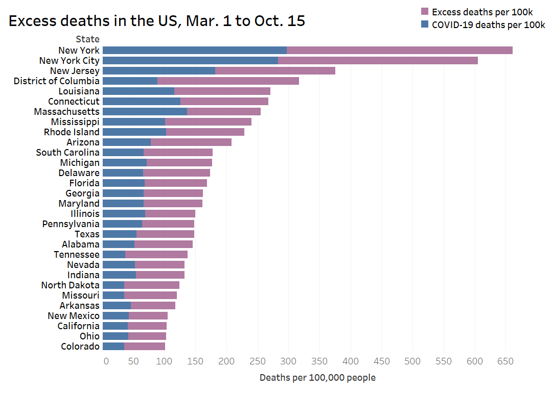
I am certainly part of that trend; I’ve started learning Tableau since the pandemic started. But a recent Stacker story allowed me to pay homage to the real viz experts. I compiled 50 charts from public sources which show the impact COVID-19 has had on America and the world at large, including a few charts I made myself. The charts visualize case counts, mortality comparisons, economic indicators, outbreak sites, and more. Frequent readers of this newsletter might recognize a few of the sources I used.
Here’s the story. If you’ve looked at nothing but election maps in the past few days, this might help pull you back to that other major crisis of 2020.
Quick reader survey
This week, I’m kicking off a series of quick surveys which I’ll be using to learn how I can better serve you, my readers. I have four of them planned, and I will send them out every other week; in the alternating weeks, I’ll share responses from readers who indicate that they’re comfortable with it.
And when I say quick, I do mean quick. It is literally one question. If you don’t believe me, try it out yourself.
Featured data source
This source, along with all others featured in previous weeks, is included in the COVID-19 Data Dispatch resource list.
Household Pulse Survey by the U.S. Census: I featured this source—a survey program run by the U.S. Census to determine how COVID-19 impacted the lives of American residents—back in August. The Census did an initial round of surveys from April through July. But the dataset was so widely used that the Census expanded it to a second round of surveys, from August through October. New data are now being released in two-week intervals.
COVID source callout
In some states, if you would like to see the numbers of COVID-19 cases and deaths for different racial and ethnic groups, you can simply look at tables clearly presented on the state’s public health dashboard.
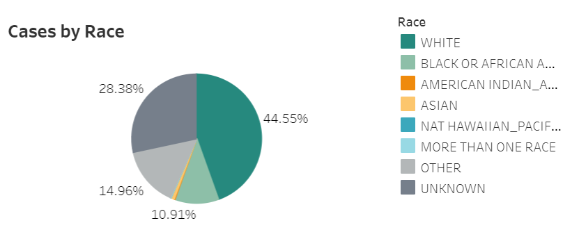
In Missouri, it is not so easy. Missouri presents its race and ethnicity data in pie charts, showing the percents of cases and deaths that are reported in each category. A lot of states use this type of pie chart presentation, as it draws attention to the most impacted groups. But pie charts have a significant drawback: smaller demographic groups, such as Native American/Alaska Native and Native Hawaiian/Pacific Islander, are relegated to tiny slices which are nearly impossible to see. These groups may be disproportionately impacted by COVID-19, but the pie chart makes them seem unimportant.

It takes several rounds of hovering, recording percentages, and running calculations to determine COVID-19 case and death numbers for those smaller racial groups in Missouri. Demographic data should not be this complicated.
More recommended reading
Stacker health content
News from the COVID Tracking Project
Bonus
5 more Wisconsin prisoners die from COVID-19, bringing DOC's total to 10 deaths (Wisconsin State Journal)
Biden’s ready to start his pandemic response immediately (STAT News)
State Variation in Seasonal Flu Vaccination: Implications for a COVID-19 Vaccine (Kaiser Family Foundation)
That’s all for today! I’ll be back next week with more data news.
If you’d like to share this newsletter further, you can do so here:


