

15 states are reporting COVID-19 vaccination data
15 states are reporting COVID-19 vaccination data
While the federal government put out a major COVID-19 data release this week, it has yet to share a vaccination dashboard.
Welcome back to the COVID-19 Data Dispatch.
It’s been a big week for COVID-19 data. The FDA authorized Moderna’s vaccine for emergency use. The federal government released comprehensive, local data that watchdogs have demanded for months. Texas’ new vaccination dashboard made me cry.
The week’s big story is, of course, vaccination data—who’s reporting it, what demographic information is available, and the lack of a federal source (so far). I’m also unpacking another big release from the Department of Health and Human Services (HHS), providing updates on last week’s hospitalization data release, and new sources on schools, prisons, and more.
If you were forwarded this newsletter, you can subscribe here:
To read this issue on Substack, see the archive:
National numbers
In the past week (December 13 through 19), the U.S. reported about 1.5 million new cases, according to the COVID Tracking Project. This amounts to:
An average of 211,000 new cases each day
451 total new cases for every 100,000 Americans
1 in 222 Americans getting diagnosed with COVID-19 in the past week
39% of the total cases reported across the globe this week, according to the World Health Organization

Cases appear to be slowing nationwide, the Project’s weekly update reports—but the trend should be interpreted with caution, as many cases reported last week were delayed by the Thanksgiving holiday. And national counts obscure regional patterns: while the Midwest may have finally passed its peak of new cases, the Northeast, South, and West are all facing still-rising outbreaks. California alone reported 287,000 cases this week, and the state’s hospitals are already full.
Last week, America also saw:
114,000 people now hospitalized with COVID-19 (35 for every 100,000 people)
18,300 new COVID-19 deaths (5.6 for every 100,000 people)
The nation continues to pass its own record for deaths reported in a single week. COVID-19 is, unambiguously, the leading cause of death in the U.S. right now.
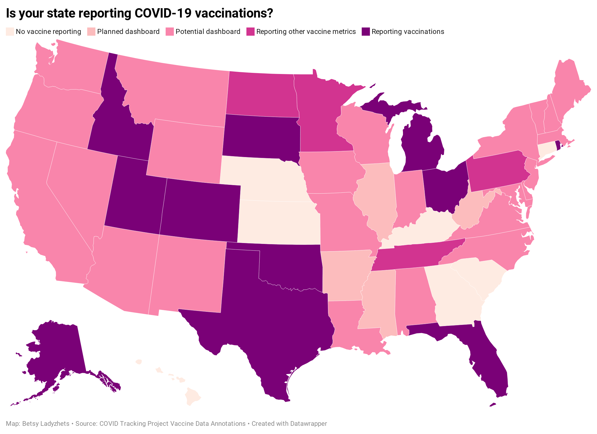
15 states are reporting COVID-19 vaccination data—federal government lags behind
Back in September, I read the Interim COVID-19 Vaccination Playbook released by the Centers for Disease Control and Prevention—the first national plan for how vaccination was supposed to proceed. Here’s an excerpt from my newsletter issue covering this playbook:
Once COVID-19 vaccination begins, the CDC will report national vaccination data on a dashboard similar to the agency’s existing flu vaccination dashboard. According to the playbook, this dashboard will include estimates of the critical populations that will be prioritized for vaccination, locations of CDC-approved vaccine providers and their available supplies, and counts of how many vaccines have been administered.
This past week, the first COVID-19 vaccine doses were administered to frontline healthcare workers across the country. The FDA issued Emergency Use Authorization to a second vaccine. But I haven’t seen a vaccination dashboard from the CDC; the closest we’ve come so far is a dataset listing initial allocations of Pfizer doses for every state. This federal agency is lagging behind several states that are making their vaccination counts public, as well as journalists who have already begun to compile the limited information that’s available.
Here’s how the reporting of vaccination data is supposed to work. When someone goes in to get their COVID-19 shot, the provider of that shot will enter their name and other personal information to a state registry called an Immunization Information System, or IIS. Vaccine providers that issue shots and send data may include hospitals, clinics, pharmacies, pop-up vaccination sites, and any other institution that is giving shots.
Most states and several large cities, like New York City, have these immunization registries; New Hampshire is still getting its registry ready to track COVID-19 vaccines. The registries stay private, with data only available for the people who ship, administer, and manage vaccines. A data system called the IZ gateway will help different state immunization systems link up with each other and with the CDC, which has asked all states to formally agree to share their data with this federal agency. (The CDC has asked states to share a pretty extensive list of data points for each vaccine patient, including names and addresses, which some states are not willing to send.)
The CDC has also developed a system to help vaccine providers manage supplies and patients, a public-facing website that will help Americans see where they can get vaccinated, and a new software that will pull all vaccine-related information into one place for Operation Warp Speed officials to use. Finally, an HHS data system called the Vaccine Adverse Event Reporting System will collect information on patient reactions to the vaccines, such as headaches and fatigue—both of which are expected reactions to the Pfizer and Moderna vaccines.
For more detail on these data systems, see this article by USA TODAY’s Aleszu Bajak and Janet Loehrke, which I drew upon to write this part of the newsletter.
Theoretically, the CDC should have precise counts of how many people have received vaccine doses in every state, as well as personal identifying information for all of those people. So far, however, it appears that many states are beginning to make these data public, while the federal government has yet to release national numbers.
According to ongoing analysis by the COVID Tracking Project, 15 states are reporting some form of vaccination data as of December 19. Here’s the breakdown:
Five states have added a count of vaccine doses administered as a single metric on their dashboards: Alaska, Colorado, Idaho, Oklahoma, and Rhode Island.
Two states have added vaccination-specific pages to their dashboards: South Dakota and Utah.
Three states have built entirely new dashboards for vaccination: Michigan, Ohio, and Texas.
Florida is releasing daily vaccination reports.
Four states are reporting vaccine-related metrics (such as counts of approved providers and doses delivered) that don’t yet include actual counts of the doses administered: Minnesota, Pennsylvania, North Dakota, and Tennessee.
Five states are reporting some form of demographic data: Michigan reports vaccinations by age; Texas reports by county; Utah reports by local health jurisdiction; Ohio reports by age and county; South Dakota reports by age, gender, and county; and Florida reports by race, age, gender, and county.
For links to all of these states’ dashboards and reports, see the COVID Tracking Project’s annotations.
Florida is the only state to report vaccination counts broken down by race so far, though the state has not yet reported such counts for different ethnicities. Public health experts have widely agreed that people of color—especially Black Americans, Native Americans, and Hispanic/Latino Americans—should be prioritized in COVID-19 vaccination because these communities have been disproportionately impacted by the pandemic. But without knowing vaccination rates in these vulnerable communities, it will be impossible to determine whether they are receiving the medical treatment they deserve.
A recent article by ProPublica’s Caroline Chen, Ryan Gabrielson, and Topher Sanders calls attention to the lack of standardization that currently exists for state collection of race and ethnicity data:
In state vaccination registries, race and ethnicity fields are simply considered “nice to have,” explained Mitchel Rothholz, chief of governance and state affiliates for the American Pharmacists Association. While other fields are mandatory, such as the patient’s contact information and date of birth, leaving race and ethnicity blank “won’t keep a provider from submitting the data if they don’t have it.”
In other words, if a Black woman gets the Moderna vaccine at a Walgreens in Brooklyn, she could feel uncomfortable disclosing her race on the pharmacy’s form—and little action would be taken to explain to her why such disclosure is important and how her information would be used. The “race” checkbox on her form would be left blank. She would likely go uncounted by researchers and journalists trying to hold the government accountable to its promises of equity.
The federal government should be both more rigorous in requiring race and ethnicity data and more transparent in disclosing these data—but I’d take a simple, national count of how many people in America have received COVID-19 shots to start. Recent data releases from the HHS have made me pretty optimistic about the federal public health agency’s ability to be transparent (see: the next two sections of this issue.) But the lack of a federal dataset so far means that key COVID-19 information is once again scattered.
In a Poynter webinar last week, Al Thompkins asked a panel of top infectious disease experts—including scientists on both the FDA’s and the CDC’s vaccine advisory panels—a simple question: Will the public be able to see counts of how many people are getting vaccinated? None of those experts had a clear answer. There may be a dashboard in the works behind the scenes of which the panelists hadn’t been informed, but their responses still did not inspire confidence.
Of course, journalists are once again stepping in to cobble together vaccination counts from all the public sources they can find. Bloomberg has counted 211,000 Pfizer doses in the U.S., as of December 19, by compiling numbers from state websites, press conferences, and interviews. The New York Times has surveyed state public health departments. Benjy Renton continues to update a Tableau dashboard that compares planned Pfizer and Moderna shipments to state populations.
And the Kaiser Family Foundation released its COVID-19 Vaccine Monitor, an ongoing project to track public perception of and experiences with vaccination. The latest survey from this monitor shows that 71% of Americans would “definitely or probably” get a vaccine for COVID-19 if it was determined to be safe and freely available.
This week, as I’ve seen the vaccination numbers—and the photos of frontline healthcare workers getting these well-deserved shots—I’ve felt something strange. Something hopeful. For the first time since March, I’m looking at numbers that I actually want to see go up. Now, if we could just get more comprehensive numbers, and get them more standardized, and get them reported with a priority on racial justice…
If you appreciate the news and resources, I’d appreciate a tip:
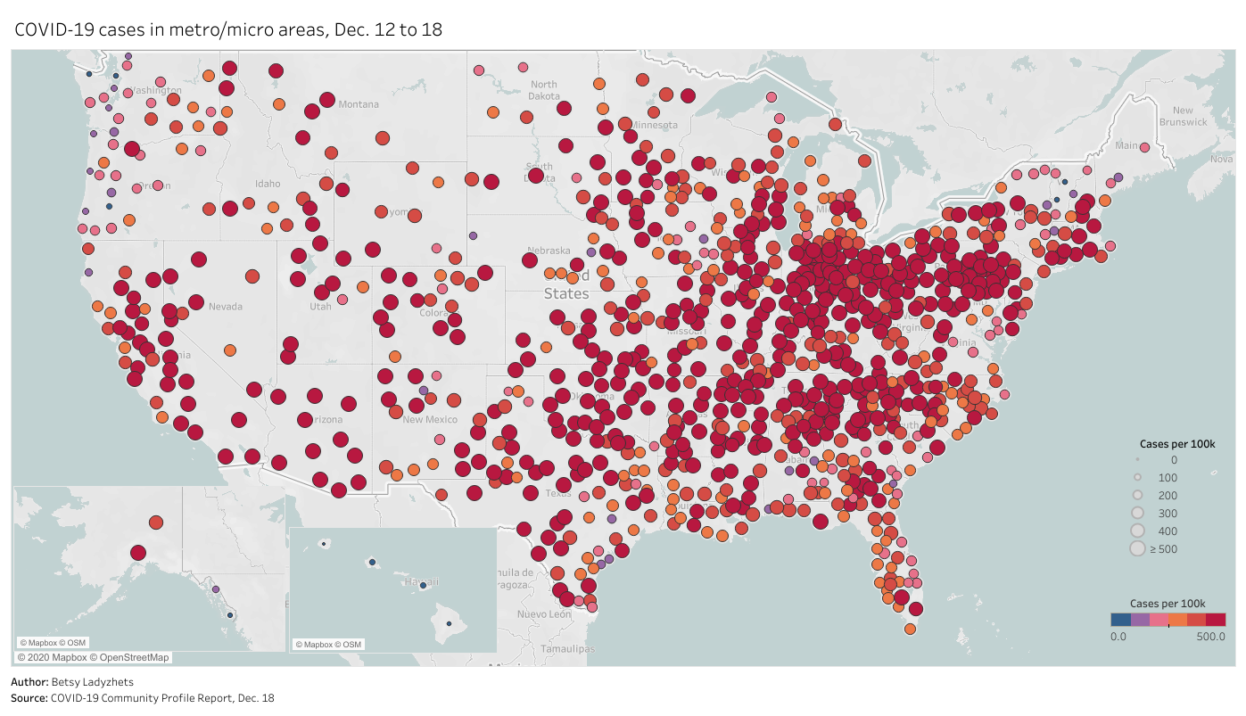
HHS releases long-awaited national profile reports
For months, public health advocates have called on the federal government to release in-depth data reports that are compiled internally by the White House Coronavirus Task Force.
The reports include counts of COVID-19 cases, deaths, and tests, as well as test positivity calculations. In addition to state-level data, the reports feature county-level data and even data for individual metropolitan areas, color-coded according to risk levels for each region. The reports have also drawn on these data to provide specific recommendations for each state. They have been a key piece of the federal government’s support for governors and other state leaders—but they haven’t been shared with the public.
Liz Essley Whyte and her colleagues at the Center for Public Integrity have obtained copies of many of these reports and made them publicly available. But the scattered PDFs—often posted for only a few states at a time—provided only small snapshots from the vast trove of data HHS was using behind the scenes.
This past Friday, the Department of Health and Human Services (HHS) began releasing all national COVID-19 reports and the data behind them. Now officially called “COVID-19 Community Profile Reports,” the reports are expected to be released as PDFs and spreadsheets every day.
I asked Liz Essley Whyte why this release—one that she’s spent months pushing for—is so important. Here’s what she said:
This release has local data that is so important for helping people make daily decisions about what’s safe. It also gives us the same picture of the pandemic that our federal government does, allowing us to weigh its response. It’s data that was assembled with taxpayer dollars and that affects everyone’s lives, so it was past time for it to be made public. I’m very glad it’s out there now. I think if it’s pursuing full transparency the White House should also make public the policy recommendations it gives to states weekly in the governors’ reports, alongside this helpful data.
Whyte has also provided a tour of the information available in these reports, specifically geared towards local journalists who might want to use them.
Here’s my own tour, a.k.a. why I’m excited about this new dataset:
Data on metropolitan areas: Other sources were compiling state- and county-level data prior to Friday, but standardized data on how COVID-19 is impacting America’s cities were basically impossible to find. This new dataset includes information on over 900 metropolitan and micropolitan areas, making it much easier to compare outbreaks in urban centers.
Standardized data: One of the biggest challenges for COVID-19 data users has been a lack of consistency. Some states report every day of the week, some skip weekends. Some states report their tests using one unit, some report using another. Some states include antigen tests in their numbers, some don’t. And so on. But the HHS can smooth out these inconsistencies internally, as national testing laboratories and state public health departments are all required to report in the same way. What I’m saying is, this new report allows us to do something we haven’t been able to reliably do since the start of the pandemic: compare testing numbers across states.
Major metrics in one place: Before Friday, if I wanted case and death numbers by county, I’d go to the New York Times, while if I wanted testing numbers by county, I’d go to the Center for Medicare & Medicaid Services. The scattered nature of pandemic reporting has led researchers and journalists to cobble together stories from multiple disparate sources; now, we can get three major metrics in one easy place. (This data reporter loves to only have one Excel spreadsheet open at a time.)
Contextual data built in: Not only does this new dataset include several important metrics in one place, it also contextualizes those metrics with key demographic information. For each state, county, and metro area in the dataset, numbers such as the share of this region living without insurance and the share of the region over age 65 are included right next to that region’s COVID-19 metrics. Two indices that indicate the region’s demographic vulnerability to the virus are also included: the CDC’s Social Vulnerability Index and the Surgo Foundation’s COVID-19 Community Vulnerability Index. I covered both in my November 29 issue.
Rankings for policymakers: In addition to raw counts of cases, deaths, and tests, the Community Profile Reports include calculated values that make it easy for local leaders to see how their communities compare. The reports rank states according to their cases per 100,000 population, positivity rate (for PCR tests), hospital admissions, and other metrics. They highlight key cities that demand attention and aid, such as Phoenix, Arizona and Nashville, Tennessee. They even forecast death totals based on current case counts—a morbid metric, but a useful one nonetheless.
More transparency: Like the facility-level hospitalization dataset released last week, the Community Profile Reports signify that the HHS is finally stepping up to provide the American public with the information that informs key public health decisions. The absence of national data during this pandemic was never meant to be filled permanently by journalists or volunteer data-gatherers—the federal government is built for this work. Journalists are, instead, built to watch this work closely and hold it accountable.
In the agency’s Friday press release, HHS states:
HHS believes in the power of open data and transparency. By publicly posting the reports that our own response teams use and by having others outside of the federal response use the information, the data will only get better.
As of Saturday night, the dataset has already been downloaded nearly 6,000 times. That’s nearly 6,000 people who can use these data and make them better—and the number will only grow.
Facility-level hospitalization data updated on schedule
In the interest of giving credit to the HHS where credit is due: the agency updated its new facility-level hospitalization dataset right on schedule this past Monday.
This dataset allows Americans to see exactly how COVID-19 is impacting individual hospitals across the country. In last week’s issue, I explained why I was excited about this dataset and what researchers and reporters could do with it. (The highlights: hyperlocal data that can be aggregated to different geographies, a time series back to August, demographic information on COVID-19 patients, and HHS transparency.)
Last week, I used this hospitalization dataset—along with the HHS’s state-level hospitalization data—to build several visualizations showing how COVID-19 has hit hospitals at the individual, county, and state levels.
I also wrote a brief article on COVID-19 hospitalizations for Stacker, hosting visualizations and highlighting some major insights. The article was sent out to local journalists across the country via a News Direct press release. (If your outlet wants to repurpose Stacker’s article, get in touch with my coworker Mel at melanie@thestacker.com!)
A few national statistics:
Nearly 700 hospitals are at over 90% inpatient capacity, as of the most recent HHS data. 750 hospitals are at over 90% capacity in their ICUs.
The states with the highest rates of occupied beds are Maryland (79.8% of all beds occupied), Washington D.C. (80.0%), and Rhode Island (85.2%).
States with the highest shares of their populations hospitalized with COVID-19 are Arizona (53 patients per 100,000 population), Pennsylvania (55 per 100K), and Nevada (67 per 100K).
19% of hospitals in the nation are facing critical staffing shortages, while 24% anticipate such a shortage within the next week.
Staffing shortages are highest in Arkansas (33.6% of hospitals in the state), Wisconsin (35.6%), and North Dakota (42.0%).
Meanwhile, The Accountability Project has developed a datasette version of this hospitalization dataset. With a bit of code, you can query the data to access metrics for a specific hospital, city, county, or state. The Project has provided example queries to help you get started.
Schools go on winter break but discourse continues
Rounding out the issue with a couple of updates on school data:
CDC issues new estimates for the cost of keeping K-12 schools safe: It would take about $22 billion for all public schools in the country to safely reopen in the spring, according to the CDC. The state-by-state estimates incorporate face masks, desk shields, cleaning supplies, transportation, and more. But these estimates are “significantly lower” than other estimates calculated by education organizations, as the CDC failed to include additional costs for face masks, food service, and contact tracing, according to U.S. News & World Report.
Rockefeller Foundation advocates for mass testing in schools: “Altogether, K-12 schools, their students, teachers and staff, will need approximately 300 million Covid-19 tests performed each month from February through June,” write the authors of a new Rockefeller report focused on safely controlling COVID-19 spread while vaccines are rolled out. The report provides detailed guidelines on testing and case studies from which readers can learn.
The College COVID-19 Outbreak Watchlist goes on winter break: After 15 weeks of updating his watchlist of colleges with high COVID-19 case numbers, Benjy Renton is taking a couple of weeks off. (From this dashboard, anyway.) Many schools have also suspended their COVID-19 reporting, as few students are on campus.
Send me your favorite COVID-19 data stories
As next Sunday will mark my final issue of 2020, I’m planning to do a round-up of my favorite COVID-19 data stories from the year. But I’d like to incorporate reader suggestions, too. What were the stories that helped you understand key COVID-19 metrics, used data visualization to illuminate trends, or pointed out issues in how this pandemic has been tracked?
Send me your favorite reads using the Typeform survey linked below, comment on this post, or simply hit Reply to this email.
Featured sources
These sources, along with all others featured in previous weeks, are included in the COVID-19 Data Dispatch resource list.
Mass Incarceration, COVID-19, and Community Spread: The nonprofit Prison Policy Initiative has published a new report showing how prisons impacted COVID-19 case rates in 2020. One major finding: rural counties with more incarcerated people per square mile had more COVID-19 cases, especially at higher percentiles.
COVID Border Accountability Project: This interactive map documents travel and immigration bans that countries have introduced in response to COVID-19. It’s compiled by a team of academic researchers, engineers, and other non-academic volunteers, and updated weekly on Wednesdays.
The Buffalo News’ trackers of COVID-19 cases in college athletics: CDD reader Rachel Lenzi, who covers college athletics for The Buffalo News, has kindly allowed me to share her spreadsheets compiling COVID-19 reports of COVID-19 cases in NCAA football and basketball programs. Football spreadsheet; basketball spreadsheet.
COVID source shout-out
I am pleased to announce that I can retract an earlier critique of Michigan’s COVID-19 dashboard labeling, as the state has made a long-awaited edit.


Bonus
My recent bylines
These 6 graphs show that Black scientists are underrepresented at every level (Science News)
Breaking down how every state has responded to COVID-19 (Stacker)
News from the COVID Tracking Project
Bonus
The Free-Market Approach to This Pandemic Isn't Working (WIRED)
What the Dippin’ Dots ‘cold chain’ can teach us about COVID-19 vaccines (Popular Science)
Pandemic Backlash Jeopardizes Public Health Powers, Leaders (KHN)
1 in 5 Prisoners in the U.S. Has Had COVID-19 (The Marshall Project)
That’s all for today! I’ll be back next week with more data news.
If you’d like to share this newsletter further, you can do so here: